Creating Themes
User themes are loaded from JSON files (with the .bntheme extension) found in the themes or community-themes (consider cloning the community themes repo) subdirectories of your user folder. The default, full path to these folders is the following on each supported platform:
- macOS:
~/Library/Application Support/Binary Ninja/{themes,community-themes} - Windows:
%APPDATA%\Binary Ninja\{themes,community-themes} - Linux:
~/.binaryninja/{themes,community-themes}
To get started, create a new .bntheme file in the themes folder for your platform. You may want to copy one of the example themes to start with to avoid lots of "missing required color" errors.
Theme File Structure
Theme files have the following top-level structure:
{
  "name": "Example Theme",
  "style": "Fusion",
  "styleSheet": "...",
  "colors": { ... },
  "palette": { ... },
  "disabledPalette": { ... },
  "theme-colors": { ... }
}
Name
The name key controls the theme's display name in the UI. This key must be unique. There cannot be multiple themes with the same name.
Style
The style key specifies which Qt style to use for the UI controls. This key should almost always be set to "Fusion".
Stylesheet
The styleSheet key can be used to customize the Qt style above with a stylesheet in Qt CSS syntax, like so:
{
  "styleSheet": "QWidget { border-radius: 0; }"
}
If you need to determine what a specific control's class is in order to style it, you can use the ui.uiDeveloperTools setting to enable the Widget Inspector.
Colors
The colors key allows you (the theme author) to define color aliases to be used throughout the rest of the theme file. For example, the following sets up two color aliases, red and blue:
{
  "colors": {
    "red": "#ff0000",
    "blue": [0, 0, 255]
  }
}
Colors can be specified as hex strings or as an [R, G, B] array.
Blending Functions
In addition to color aliases, the theming engine provides the ability to blend colors by passing an array of blending functions and arguments in prefix notation in place of a color. We provide two blending functions: average ("+") and mix ("~"), as seen in the example below:
{
  "colors": {
    "red": "#ff0000",
    "blue": [0, 0, 255],
    "purple": ["+", "red", "blue"],
    "yellow": "#ffff00",
    "white": [255, 255, 255],
    "slightPink": ["~", "white", "red", 20],
    "quitePink":  ["~", "white", "red", 200],
    "slightlyPinkYellow": ["+", "~", "white", "red", 20, "yellow"]
  }
}
In this example, red and blue are averaged (+) to create purple. Colors can also be mixed (~), in a weighted manner, like the slightPink and quitePink colors (which mix red into white using two different weights, specified by the integers at the end of the array). These blending functions can also be chained together, like in the slightlyPinkYellow color, which mixes some red into white and then averages the result with yellow.
Palette
The palette key is the primary interface for theming Qt UI elements and enables customization of the main QPalette color roles. The following sub-keys are required for all themes:
{
  "palette": {
    "Window": "...",
    "WindowText": "...",
    "Base": "...",
    "AlternateBase": "...",
    "ToolTipBase": "...",
    "ToolTipText": "...",
    "Text": "...",
    "Button": "...",
    "ButtonText": "...",
    "BrightText": "...",
    "Link": "...",
    "LinkVisited": "...",
    "Highlight": "...",
    "HighlightedText": "...",
    "Light": "..."
  }
}
The PlaceholderText sub-key is currently not themeable and will be automatically set to the "disabled" Text value specified below.
Disabled Palette
The disabledPalette key matches the palette key above, but specifies colors to use for disabled controls instead. While not required, providing entries for the Button, ButtonText, Text, WindowText, and ToolTipText roles is highly recommended.
Theme Colors
The theme-colors key contains the rest of a theme's settings. These colors are typically used for custom controls or contexts specific to Binary Ninja itself (which is why they are separate from the Qt colors controlled via the palette and disabledPalette keys above).
Colors marked "required" must be specified. Unmarked colors will hold default values based upon other colors you have chosen, but will be overridden if specified.
Tokens
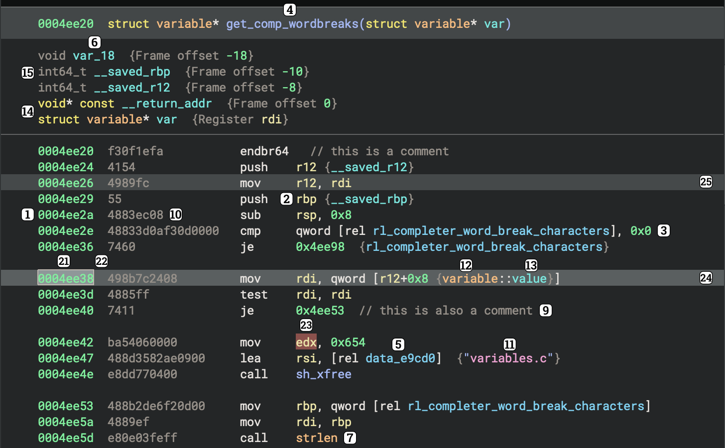
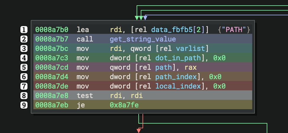
addressColor(required) - Used to color memory address tokens (e.g.0x100003c5b)registerColor(required) - Used to color register names (e.g.rax)numberColor(required) - Used to color number literals (e.g.0xf0)codeSymbolColor(required) - Used to color local function names (e.g.sub_100003c50)dataSymbolColor(required) - Used to color data symbols (e.g.data_100003e2c)stackVariableColor(required) - Used to color stack variables (e.g.var_8) in disassembly and LLIL (the stack does not exist in MLIL and above)importColor(required) - Used to color imported function names (e.g.printf)annotationColor(required) - Used to color annotations (e.g. hints), not shown in picture abovecommentColor- Used to color code commentsopcodeColor(required) - Used to color instruction opcodes (e.g.ebfe)stringColor(required) - Used to color string literals (e.g."Hello, world!")typeNameColor(required) - Used to color user-defined type names (e.g.my_struct)fieldNameColor(required) - Used to color structure member nameskeywordColor(required) - Used to color keywords (e.g.forin HLIL)uncertainColor(required) - Used to color uncertain data (e.g. variable types with low confidence)exportColor- Used to color exported symbols, not shown in picture abovenameSpaceColor- Used to color a namespace, not shown in picture abovenameSpaceSeparatorColor- Used to color the separator between a namespace and the rest of the symbol, not shown in picture aboveoperationColor- Used to color operations such as+,@,&, etc.gotoLabelColor- Used to color agoto's label, not shown in picture abovetokenSelectionColor- Used to draw the background of tokens selected with click-and-dragoutlineColor(required) - Used to draw a box around tokens selected with click-and-dragtokenHighlightColor(required) - Used to color the background of a token that has been selected with a single click or an arrow keyinstructionHighlightColor(required) - Used to color the background of an instruction that has been selected with a single click or an arrow keyrelatedInstructionHighlightColor- Used to color the background of instructions related to an instruction that has been selected with a single click or an arrow key
The following colors are used for the Rainbow Braces setting (ui.rainbowBraces):
braceOption1Color- Defaults toblueStandardHighlightColorbraceOption2Color- Defaults toorangeStandardHighlightColorbraceOption3Color- Defaults togreenStandardHighlightColorbraceOption4Color- Defaults toredStandardHighlightColorbraceOption5Color- Defaults toyellowStandardHighlightColorbraceOption6Color- Defaults tomagentaStandardHighlightColor
Hex View
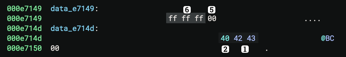
Each byte in hex view is given a background color based on its value. Values between 0x00 and 0xFF will use a color interpolated between the Dark and Light colors specified below.
alphanumericHighlightColor(required) - Used to color bytes that are alphanumeric characters if Color Highlight/ASCII and Printable is enabled in view options (default)printableHighlightColor(required) - Used to color bytes that are non-alphanumeric printable characters if Color Highlight/ASCII and Printable is enabled in view options (default)modifiedColor(required) - Used to color bytes that have been modified if Color Highlight/Modification is enabled in view optionsinsertedColor(required) - Used to color bytes that have been inserted if Color Highlight/Modification is enabled in view optionsnotPresentColor(required) - Used to color bytes that do not have a valuebackgroundHighlightDarkColor(required) - Used as the background color for bytes of value0x00if Contrast/Normal is enabled in view options (default)backgroundHighlightLightColor(required) - Used as the background color for bytes of value0xFFif Contrast/Normal is enabled in view options (default)boldBackgroundHighlightDarkColor(required) - Used as the background color for bytes of value0x00if Contrast/High is enabled in view optionsboldBackgroundHighlightLightColor(required) - Used as the background color for bytes of value0xFFif Contrast/High is enabled in view optionsselectionColor(required) - Used as the background color on any bytes that have been selected via click-and-drag
Linear View
linearDisassemblyFunctionHeaderColor(required) - Used as the background for function headers in linear viewlinearDisassemblyBlockColor(required) - Used as the background for function bodies in linear viewlinearDisassemblyNoteColor(required) - Used as the background color for note blocks in linear view, such as the info block found at the start of linear viewlinearDisassemblySeparatorColor(required) - Used as the separator/border color between major elements in linear viewindentationLineColor- Used to color the indentation line, not shown in picture aboveindentationLineHighlightColor- Used to highlight the indentation line (such as when selecting it), not shown in picture above
Graph View
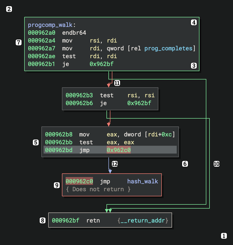
Both the graph background and individual graph nodes are actually painted as a gradient. To get a flat background instead, set the Dark and Light colors to the same color value.
graphBackgroundDarkColor(required) - Used as the bottom-right gradient stop in the graph view backgroundgraphBackgroundLightColor(required) - Used as the upper-left gradient stop in the graph view backgroundgraphNodeDarkColor(required) - Used as the bottom gradient stop in graph node backgroundsgraphNodeLightColor(required) - Used as the upper gradient stop in graph node backgroundsgraphNodeOutlineColor(required) - Used to color the border of graph nodes with no indicatorgraphNodeShadowColorgraphEntryNodeIndicatorColorgraphExitNodeIndicatorColorgraphExitNoreturnNodeIndicatorColortrueBranchColor(required) - Used to color branches taken when a comparison is truefalseBranchColor(required) - Used to color branches taken when a comparison is falseunconditionalBranchColor(required) - Used to color branches that are always takenaltTrueBranchColor(required) - Used instead oftrueBranchColorwhen color-blind mode is enabledaltFalseBranchColor(required) - Used instead offalseBranchColorwhen color-blind mode is enabledaltUnconditionalBranchColor(required) - Used instead ofunconditionalBranchColorwhen color-blind mode is enabled
Highlighting
blackStandardHighlightColor(required)blueStandardHighlightColor(required)cyanStandardHighlightColor(required)greenStandardHighlightColor(required)magentaStandardHighlightColor(required)orangeStandardHighlightColor(required)redStandardHighlightColor(required)whiteStandardHighlightColor(required)yellowStandardHighlightColor(required)
Tab Bar
tabBarTabActiveColor- Used to color the background of the currently active tabtabBarTabHoverColor- Used to color the background of any tab the mouse is currently hovering overtabBarTabInactiveColor- Used to color the background of any inactive tabtabBarTabBorderColor- Used to draw the border around the currently active tabtabBarTabGlowColor- Used to draw a glow or shadow around the border of the currently active tab
Feature Map
featureMapBaseColor- Used to color the backgroundfeatureMapNavLineColor- Used to color the line(s) that represent where you are in the binaryfeatureMapNavHighlightColor- Used as a highlight outside the navigation line(s)featureMapDataVariableColor- Used to highlight any area containing data variablesfeatureMapAsciiStringColor- Used to highlight any area containing ASCII stringsfeatureMapUnicodeStringColor- Used to highlight any area containing Unicode stringsfeatureMapFunctionColor- Used to highlight any area containing functionsfeatureMapImportColor- Used to highlight any area containing imported functions that are not from a library (see below)featureMapExternColor- Used to highlight any area containing symbols that are externsfeatureMapLibraryColor- Used to highlight any area containing symbolic functions or functions that are imported from a library
Side Bar
sidebarBackgroundColor- Used to color the background of the sidebar itselfsidebarInactiveIconColor- Used to color the icon of a sidebar that is not activesidebarHoverIconColor- Used to color the icon of a sidebar the mouse is currently hovering oversidebarActiveIconColor- Used to color the icon of a sidebar that is activesidebarFocusedIconColor- Used to color the icon of a sidebar that has the keyboard focussidebarHoverBackgroundColor- Used to color a rounded rectangle behind the icon of a sidebar the mouse is currently hovering oversidebarActiveBackgroundColor- Used to color a rounded rectangle behind the icon of a sidebar that is activesidebarFocusedBackgroundColor- Used to color a rounded rectangle behind the icon of a sidebar that has the keyboard focussidebarActiveIndicatorLineColor- Used to show a vertical line next to a sidebar that is currently activesidebarHeaderBackgroundColor- Used to color the background of the sidebar headersidebarHeaderTextColor- Used to color the text in the sidebar headersidebarWidgetBackgroundColor- Used to color the background of each sidebar widget
Mini-Graph
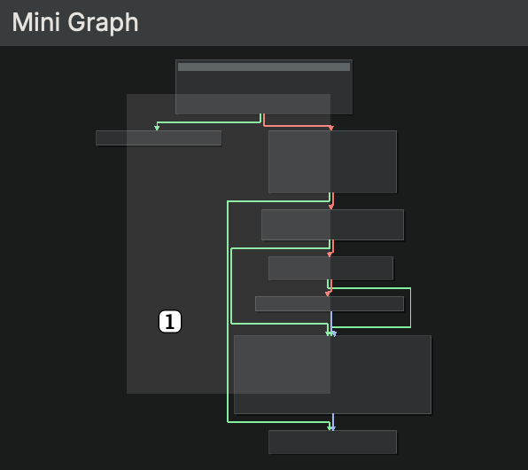
miniGraphOverlayColor- Used to color the area of the mini graph that is currently being displayed in graph view
Script Console
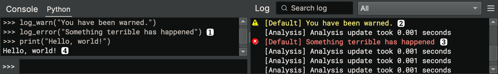
scriptConsoleOutputColor- Used to color normal output in the consolescriptConsoleWarningColor- Used to color warnings in the consolescriptConsoleErrorColor- Used to color errors in the consolescriptConsoleEchoColor- Used to color user input in the console
Panes

The image above shows an active pane on the left and an inactive pane on the right.
activePaneBackgroundColor- Used to color the background of a pane that is activeinactivePaneBackgroundColor- Used to color the background of a pane that is inactivefocusedPaneBackgroundColor- Used to color the background of a pane that has the keyboard focus, not shown in picture above
Status Bar
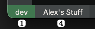
The image above shows the Enterprise button in the "connected" state (connected to a server named "dev") with an open project (named "Alex's Stuff").
statusBarServerConnectedColor- Used for the Enterprise button while connected to a serverstatusBarServerDisconnectedColor- Used for the Enterprise button while disconnected from a serverstatusBarServerWarningColor- Used for the Enterprise button when there is an issue with the server connectionstatusBarProjectColor- Used for the Project button